EDGE
ROLE
UX/UI Design Lead
PROJECT
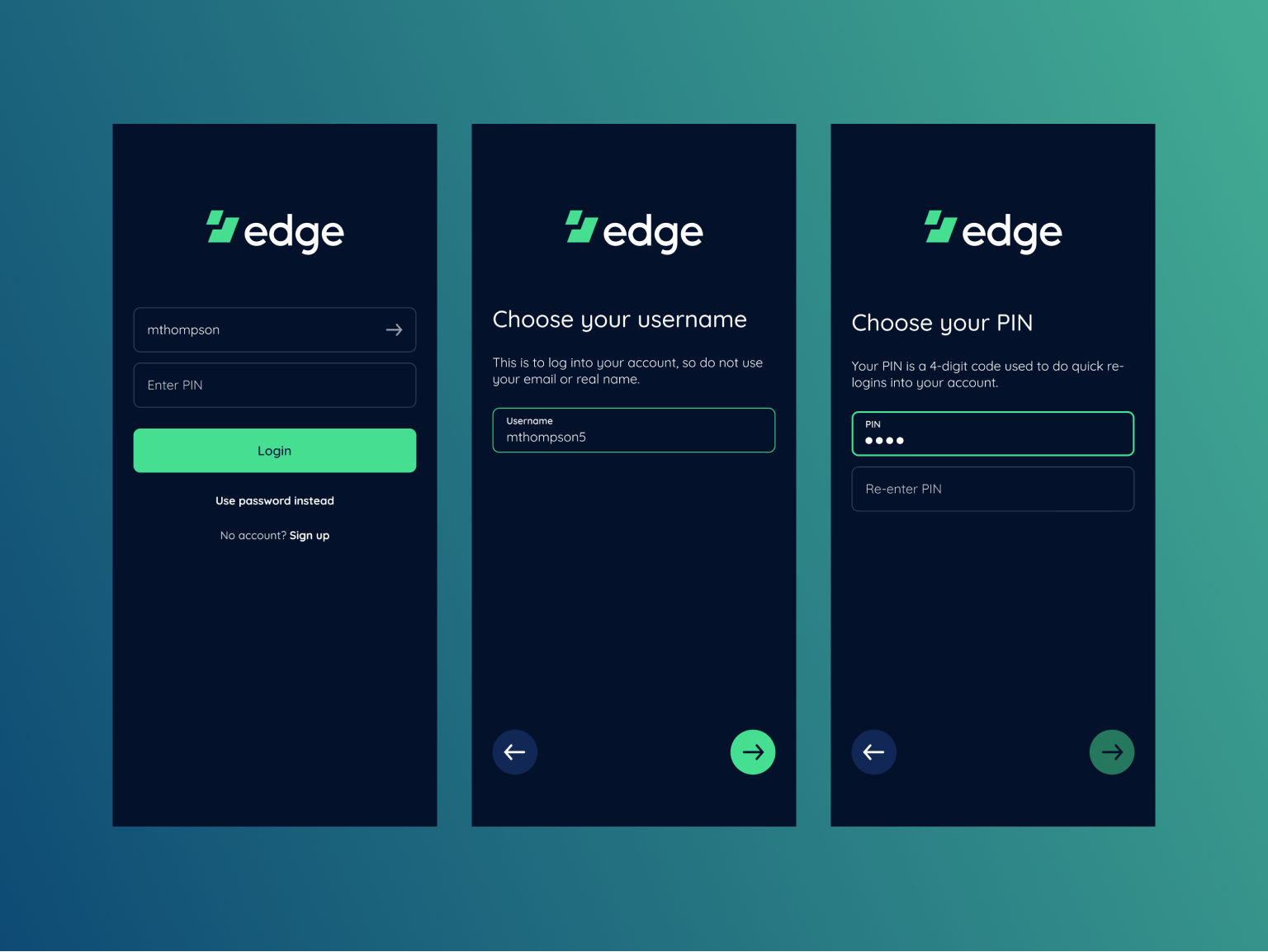
The cryptocurrency wallet Airbitz rebranded to become Edge, and they wanted to redesign their mobile app. My role as design lead was to redesign the app to be more intuitive, user-friendly, and visually engaging.
After collaboration and an audit of our current app, we discussed things we wanted to improve.
Many redundancies, same actions found in multiple places
No longer fit Edge branding, app designed for Airbitz
A more thumb-friendly app that can be navigated with one hand?
INFORMATION ARCHITECTURE
In order to ensure a smooth user experience it was important to gain an aligned understanding of it. This was achieved through company-wide collaboration and mapping out the flow.
WIREFRAMES
Ultimately, we decided to go in a different direction after some internal testing and discussion for the following reasons:
With all the main actions at the bottom of the screen, many overlapping elements will make selecting what you want more difficult
So many elements at the bottom makes the app feel imbalanced
There was confusion about a button’s purpose (especially the menu button) on different screens
The amount of engineering output required for questionable benefit and outcome
All the above issues were also exacerbated by the fact that cryptocurrency trading is a high-stakes operation. With that said, it’s especially imperative that we avoid user mistakes and UX writing is very clear.
MOCKUPS
DESIGN SYSTEM
OUTCOME
Our redesign solved a few concerns:
More simplified experience that reduces redundancies
UI presence that feels integrated with new Edge brand
A design system prioritizing consistency and scalability


